

Python ** Streamlit** is terrific for creating interactive maps from a GIS dataset.
Interactive maps that allow input from your audience can be used for deeper analysis and storytelling.
Python Streamlit is the right tool for the job. It can be used alongside the pandas for easy data frame creation and manipulation.
Let’s test this out with a deep and detailed dataset on a very prescient issue — the seeming escalation of wildfires. There is a terrific public wildfires dataset available on the site managed by Natural Resources Canada.
With this detailed dataset let’s take a modular approach to our data analysis and create:
- A static map that shows all forest fires in Canada for a period of time (ie. a particular year).
- An interactive map that allows the user to select a shorter period of time (ie. a dropdown menu by year) to view more granular data.
- A ** bar chart** that shows more granularity —the number of fires at a provincial level.
Can Python Streamlit do this for us?
** Let’s give it a go!**
The Issue
Forest fires in North America have been particularly destructive over the past 10–15 years. The most recent California fires have amplified the public awareness of this growing concern.
For us in Canada, our recent summers are often spent on our sundecks staring into a smoky haze, wondering if the winds may shift in a way that puts our community in peril.
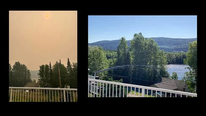
Forest fire smoke on the left, normal day on the right (Photo by author)
A common question that comes up in conversation is how bad has the wildfire situation become compared to how it used to be?
To better answer this question, and armed with a good dataset, we can create a set of visuals that tell us a data story on forest fires over time (ie. by year) for Canada, my home.
We can create these visuals as maps and charts to analyze and to learn about how the situation has changed from then to now.
The Dataset
To show the monthly effects of forest fires, we can use a dataset to create a set of data visuals that shows forest fires over time.
Natural Resources Canada (a branch of the Canadian Government) has a very detailed public data set on wildfires for the past 75 years.
All of this historical fire data for Canada is stored HERE.
On the site, we can scroll down to view and download:

For this tutorial, we can download the dataset that contains fires over 200 ha in size (Screenshot by author)
After downloading the file, we will first need to unzip it.
Once unzipped, we can select the file called NFDB_point_20240613_large_fires.txtThe
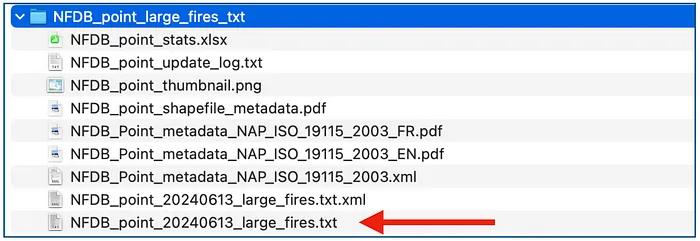
Choosing the large fires CSV file. (Screenshot by author)
This file is a comma-separated file (CSV). For ease of use, I renamed my file NFDB_large_fires.csv
Each record in this dataset represents a unique forest fire and includes several key fields:
- YEAR : The year when the fire occurred.
- LATITUDE and LONGITUDE : The geographic coordinates of the fire.
- FIRE_ID : A unique identifier for each fire.
- SIZE_HA : The size of the fire in hectares.
- FIRENAME : The given name of the fire or the nearest geographic feature.
- REP_DATE : The date when the fire was first reported.
- OUT_DATE : The date when the fire was extinguished (if available).
- CAUSE : The reported cause of the fire (e.g., natural causes like lightning or human activity).
Knowing the available fields can now assist us in asking some questions about the data.
Questions that we want answered
Now we can craft some questions about the issues that can be answered by this dataset:
** Where are the wildfires in Canada occurring?**
** How many fires are there in Canada each year?**
** Is the number of fires increasing year over year as we move forward in time?**
To get warmed up, let’s start by creating a simple static map that shows us the fire distribution for Canada in 2023.
Creating a Static Map Using Python
To start with, we can create a static map using Python, specifically using the pydeck library.
The goal here is to generate a map displaying forest fires in Canada for the year 2023 and save it as an HTML file that can be viewed in a web browser.
NOTE: ALL of the code and data files from this tutorial are available on Github: HERE
1. Loading and Filtering the Data
Here, we load the dataset containing historical forest fire data using the pandas library:
    import pandas as pd
    import pydeck as pdk
    # Load the forest fire data
    fire_data_path = 'NFDB_large_fires.csv'
    df_fires = pd.read_csv(fire_data_path)
    # Filter data for the year 2023
    df_fires_2023 = df_fires[df_fires['YEAR'] == 2023]
The file, , is read into a DataFrame named . This dataset likely contains information such as fire location (latitude, longitude), year of occurrence, fire ID, and size in hectares.
Since we are only interested in visualizing forest fires that occurred in 2023 , we filter the DataFrame to include only rows where the column equals 2023. This filtered DataFrame, , will be used to layer the data points on the map.
2. Defining the PyDeck Layer
Designing a map digitally requires the creation of layers that are displayed on the map. For this map, we need to create a layer for our point data. Each fire on the map has a longitude and latitude that defines the exact point of the fire on the map:
layer = pdk.Layer("ScatterplotLayer",data=df_fires_2023,get_position='[LONGITUDE, LATITUDE]',get_radius=10000,get_color=[255, 0, 0],pickable=True)This block creates a scatterplot layer using . Each forest fire is represented by a red circular marker on the map.
- : Specifies the type of layer to render. Here, we use a scatterplot layer to display points.
- : The filtered DataFrame is passed as the data source.
- : Specifies the coordinates for each fire point, using the columns and from the DataFrame.
- : Sets the radius of each marker in meters.
- : Defines the color of the markers in RGB format. corresponds to red.
- : Enables interaction with the points, allowing tooltips or popups to display information when a user hovers over a marker.
3. Setting the Map’s Viewport
We need to set a longitude and latitude point for the initial load of our map view:
view_state = pdk.ViewState(latitude=df_fires_2023['LATITUDE'].mean(),longitude=df_fires_2023['LONGITUDE'].mean(),zoom=3,pitch=0)The defines the initial view of the map when it is loaded. It specifies the latitude , longitude , zoom level , and pitch (tilt) of the camera.
- and: The center of the map is set to the mean latitude and longitude of all fire points in the filtered dataset.
- : Sets the zoom level, ensuring that the map covers a large portion of Canada.
- : The pitch, or tilt angle, of the map is set to 0, meaning the view is directly overhead.
4. Rendering and Saving the Map
r = pdk.Deck(layers=[layer], initial_view_state=view_state, tooltip={"text": "Location: {FIRENAME}\nSize: {SIZE_HA} ha"}) html_file_path = "forest_fires_2023_map.html" r.to_html(html_file_path)This line creates a object, which combines the scatterplot layer () and the viewport (). Additionally, a tooltip is defined to display information when the user hovers over a point on the map. The tooltip shows:
- LOCATION : A unique identifier for the fire.
- Size : The size of the fire in hectares.
Finally, the map is saved as an HTML file using . The resulting file, , contains a fully functional static map that can be opened in any web browser. This allows the user to explore the forest fire data interactively without needing Python or PyDeck.
The detailed result:
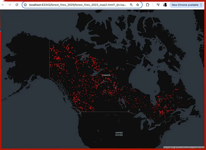
Static map generated as HTML and viewed in browser. (Screenshot by author)
OK, that looks pretty good. It looks like quite a number of fires in the year 2023. However, we have no further context for this data. For example:
- Is this number more or less than other years?
- Is this a normal distribution of fires?
So using this static map as our foundation, let’s try integrating PyDeck with Streamlit to allow dynamic interaction. For example, we can provide users with a dropdown menu containing multiple years of data.
Creating a Dynamic Map Using Streamlit
For this phase, let’s start by allowing users to select a specific year from a dropdown menu. The fires for that year are then visualized on the map.
With Streamlit , we can create a dynamic web application that enables users to select a specific year from a dropdown menu and visualize the corresponding forest fires on an interactive map.
Let’s go through a step-by-step implementation!
1. Additional Libraries
We need to add 2 libraries to our code:
    import streamlit as st
import plotly.express as px- : allows us to create an interactive web application
- : allows us to create interactive charts and graphs.
2. Adding a Dropdown Menu for Year Selection
For interactivity, let’s add a dropdown menu that allows the user to select a year from a range of years. Fo this tutorial, let’s set the range of years from 2000 to 2023:
# Dropdown menu for year selection year_selected = st.selectbox("Select Year", options=list(range(2000, 2023)))This line of Python code creates a dropdown menu using , allowing the user to select a specific year from 2000 to 2023. The selected year is stored in the variable .
3. Filtering Data Based on the Selected Year
Once the user selects a year, then we can filter the pandas dataframe to use the data from only that year:
# Filter data to include only fires for the selected year, replace NaN with None df_fires_selected = df_fires[df_fires['YEAR'] == year_selected].copy() df_fires_selected = df_fires_selected.where(pd.notnull(df_fires_selected), None)The column matches the selected year. Any values in the dataset are replaced with to ensure proper JSON formatting when rendering the map.
4. Creating the PyDeck Layer
Those of you who have worked with GIS data before know that we present data on a map in layers. We only have one layer of data to add to our map, for the fire points:
# Create the PyDeck layer for fire points layer = pdk.Layer( "ScatterplotLayer", data=df_fires_selected, get_position='[LONGITUDE, LATITUDE]', get_radius=15000, get_color=[255, 0, 0], pickable=True )A scatterplot layer is created using to display the fires on the map. The key parameters are:
- : Specifies the type of layer.
- : Uses the filtered dataset for the selected year.
- : Specifies the coordinates for each fire point.
- : Sets the marker radius to 15,000 meters for better visibility.
- : Colors the markers red.
- : Enables interaction, allowing tooltips to display information when hovering over a point.
5. Setting the Viewport for the Map
The viewport gives us a window into a map base layer. For our map, we want to center it in on Canada so we can view all the fires for a given year:
# Set the viewport to show all of Canada view_state = pdk.ViewState( latitude=60.0, longitude=-100.0, zoom=2.6, pitch=0 )The viewport is configured using , centering the map over Canada with a zoom level of 2.6 to display the entire country.
6. Creating the Pydeck Deck.gl Map
Now that we have our fire data layer ready to go and our view set to Canada, we can load in the base map:
# Create the deck.gl map map_deck = pdk.Deck( layers=[layer], initial_view_state=view_state, map_style="mapbox://styles/mapbox/satellite-v9", tooltip={"text": "Province: {SRC_AGENCY} Date: {MONTH}/{DAY} Size: {SIZE_HA} ha"} )- : object is created to render the map.
- : loads the data from our fire data layer
- : is set to a satellite view using a Mapbox style. If you want to change the type of base map, you can do it here.
- : display the province, date, and size of each fire (when the user hovers the mouse over the marker)
That’s it for the map! Now let’s add in a bar chart to tell a more detailed story.
7. Generating a Bar Chart for Fire Counts by Province
For the bar chart, let’s break down the fire data by province for the current year that has been chosen:
# Generate fire counts by province province_fire_counts_df = df_fires_selected['SRC_AGENCY'].value_counts().reset_index() province_fire_counts_df.columns = ['SRC_AGENCY', 'Fire Count'] # Plot the bar chart using Plotly fig = px.bar( province_fire_counts_df, orientation='h', x='Fire Count', y='SRC_AGENCY', labels={'Fire Count': 'Number of Fires', 'SRC_AGENCY': 'Province'}, color_discrete_sequence=['red'] ) # Display map (70%) and bar chart (30%) side by side with custom width col1, col2 = st.columns([7, 3]) with col1: st.pydeck_chart(map_deck) with col2: st.plotly_chart(fig, use_container_width=True)The bar chart is using Plotly to visualize the number of fires by reporting agency (province).
The bar chart is configured to display horizontal bars, with the fire count on the x-axis and province codes on the y-axis.
The bars are colored red to match the red theme of the map markers. Lastly, we add in the code () to put the map side-by-side with the chart. This layout ensures a clean and intuitive user interface.
Perfect!
8. Displaying the Total Fire Count
Lastly, below the map and chart, for some additional context, let’s add in the total count of fires for that particular year:
# Display total fire count below the map and chart total_fire_count = df_fires_selected.shape[0] st.markdown(f"### Total Fires for the Year {year_selected}: <span style="color:red; font-weight:bold;">{total_fire_count}</span>", unsafe_allow_html=True)The fire count is styled in bold red text for emphasis.
Our beautiful result:
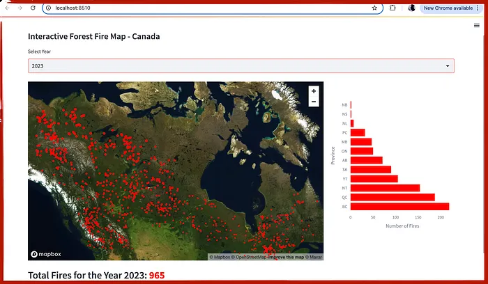
Intereactive Streamlit map viewed in browser (Screenshot by author)
Wow! That really does look great. The user can select the year from the dropdown menu and the map, bar chart and total values are all updated based on the selected year.
Now if we go from year to year and view the charts and numbers, this data set shows that 2023 was a truly terrible year for fires in Canada.
To verify this observation, we can create a chart from this dataset that calculates the total number of fires by year:
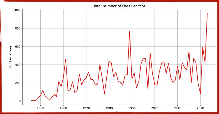
Time-series line chart showing total number of fires from 1945–2023 (Screenshot by author)
This chart shows that 2023 was the worst wildfire year in Canadian history.
The total of 923 fires (larger than 200 hectares) eclipses the old record of 775, set in 1989.
NOTE: The code for this chart is also available on Github (HERE)
And that’s all she wrote!
In Summary…
Not being a Streamlit expert prior to this exercise, I found this process of creating an interactive Python Streamlit dashboard much easier than I expected.
If you follow a modular approach as laid out in this article, you can apply it using any CSV file that includes GIS data.
It’s worth noting that I was expecting to have to use a JSON or geoJSON file to accurately display the points on a map (ie. By country and by province). As our dataset contained a “Province” field, this greatly simplified the categorization of our data, particularly for the bar chart.
Give this code a try! And please leave a comment — let me know how it goes!
GITHUB repository: HERE
NOTE: The fire points dataset used in this article is distributed by the CWFIS dataset under the Open Government License Canada. More details can be found HERE.